Dickies Medical Fall 24
Case Study: Dickies Medical Fall 2024 Campaign
Client: Dickies Medical
Project: Fall 2024 Season Campaign - Introducing New Colors
Overview
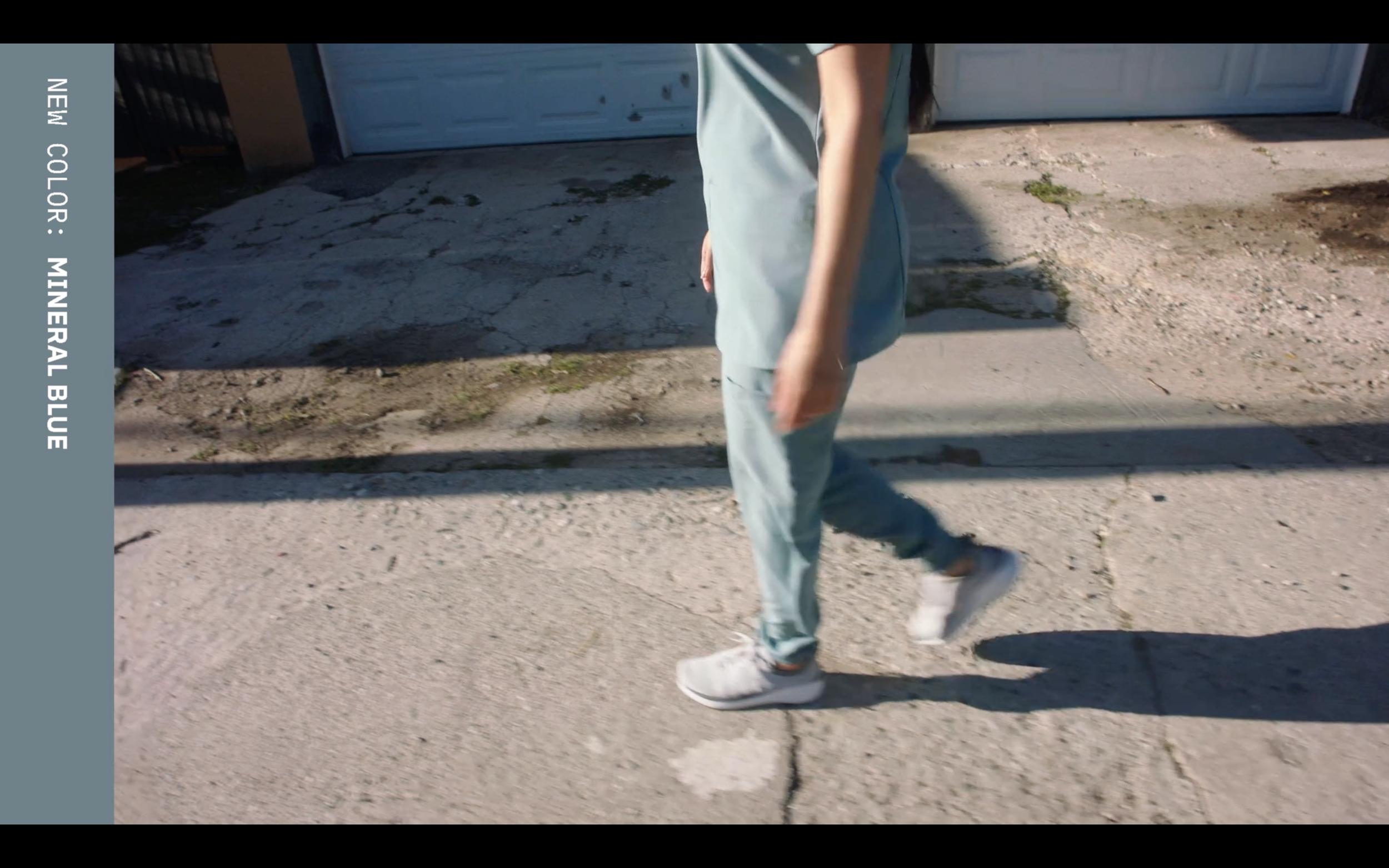
Dickies Medical, a leader in healthcare apparel, faced a challenge for their Fall 2024 season. While introducing new colors such as Hunter, Ginger Glow, Mineral Blue, and Heather Clay to their existing product lines, the design team needed to innovate their campaign approach. Despite maintaining consistent styles and bodies across their products, the emphasis was on refreshing the offerings with trendy fashion colors.
Objective
The primary goal was to showcase the new color palette in a compelling way that resonated with Dickies Medical's audience while maintaining the brand's reputation for durability and functionality in healthcare apparel. The campaign aimed to highlight the updated color options and subtly introduce a refreshed aesthetic without altering the core designs.
Concept
The creative concept centered around the human element and authenticity, moving away from traditional healthcare settings to a residential environment. This approach aimed to humanize the brand and create a relatable connection with the audience. By featuring the apparel in a familiar, everyday setting, the campaign sought to portray Dickies Medical as not just a product but a lifestyle choice.
Execution
The design team meticulously executed the concept by staging the shoot in various residential settings. Each location was carefully chosen to complement and enhance the new colors, ensuring they stood out vibrantly against the backdrop of everyday life. The campaign photography captured real moments of comfort and functionality, emphasizing how the apparel seamlessly integrates into the lives of healthcare professionals.
Results
The Fall 2024 campaign received positive feedback from both internal stakeholders and external audiences. The introduction of the new colors coupled with the fresh approach to showcasing them garnered attention and engagement across Dickies Medical's digital and social media platforms. Sales data indicated a notable uptick in interest and conversions related to the new color offerings.
Conclusion
The success of the Fall 2024 campaign underscored the effectiveness of blending fashion-forward updates with a grounded, relatable campaign narrative. By focusing on the human element and leveraging residential settings, Dickies Medical not only introduced new colors but also reinforced its brand identity as a trusted choice in healthcare apparel.
Lessons Learned
This project highlighted the importance of aligning product updates with innovative campaign strategies that resonate with the target audience. By staying true to core values while embracing change, Dickies Medical demonstrated agility and creativity in adapting to evolving market trends.
This case study reflects the strategic approach and creative execution that led to the success of Dickies Medical's Fall 2024 campaign, showcasing how a simple concept rooted in human connection can drive significant results in brand perception and consumer engagement.
My Role
Creative Direction


