Emma Skye
Case Study: Rebranding of Emma Skye - A Private Label Personal Care Brand
Client Overview
Emma Skye is a private label personal care brand based out of Orange County, California. Specializing in skincare and hair care products, Emma Skye’s target audience is primarily younger consumers seeking high-quality yet approachable products. Prior to this rebrand, Emma Skye's visual identity was minimalist, relying heavily on a simple black-and-white color palette. The brand was primarily sold at local markets in Orange and Los Angeles counties, and while it had established a customer base, it lacked a distinct visual identity that resonated with the energy and personality of its target demographic.
Objective
The objective of this project was to revamp the visual identity of Emma Skye to appeal to a younger, trend-conscious audience. The goal was to transform the brand’s image from a straightforward, minimalist design into something more vibrant, playful, and energetic — reflecting the brand's ethos of freshness, vitality, and self-care.
Challenge
Emma Skye’s previous branding, while simple and functional, did not adequately represent the dynamic and youthful nature of its products. The challenge was to inject life into the brand’s visual identity, while still maintaining a sense of elegance and quality. The new design had to be both bold and approachable, creating a memorable and distinct presence in a competitive market.
Solution: Rebranding Approach
The rebranding process was focused on creating a visual identity that communicated fun, energy, and accessibility without sacrificing the premium nature of the products. Several key elements were incorporated into the redesign:
Color Palette
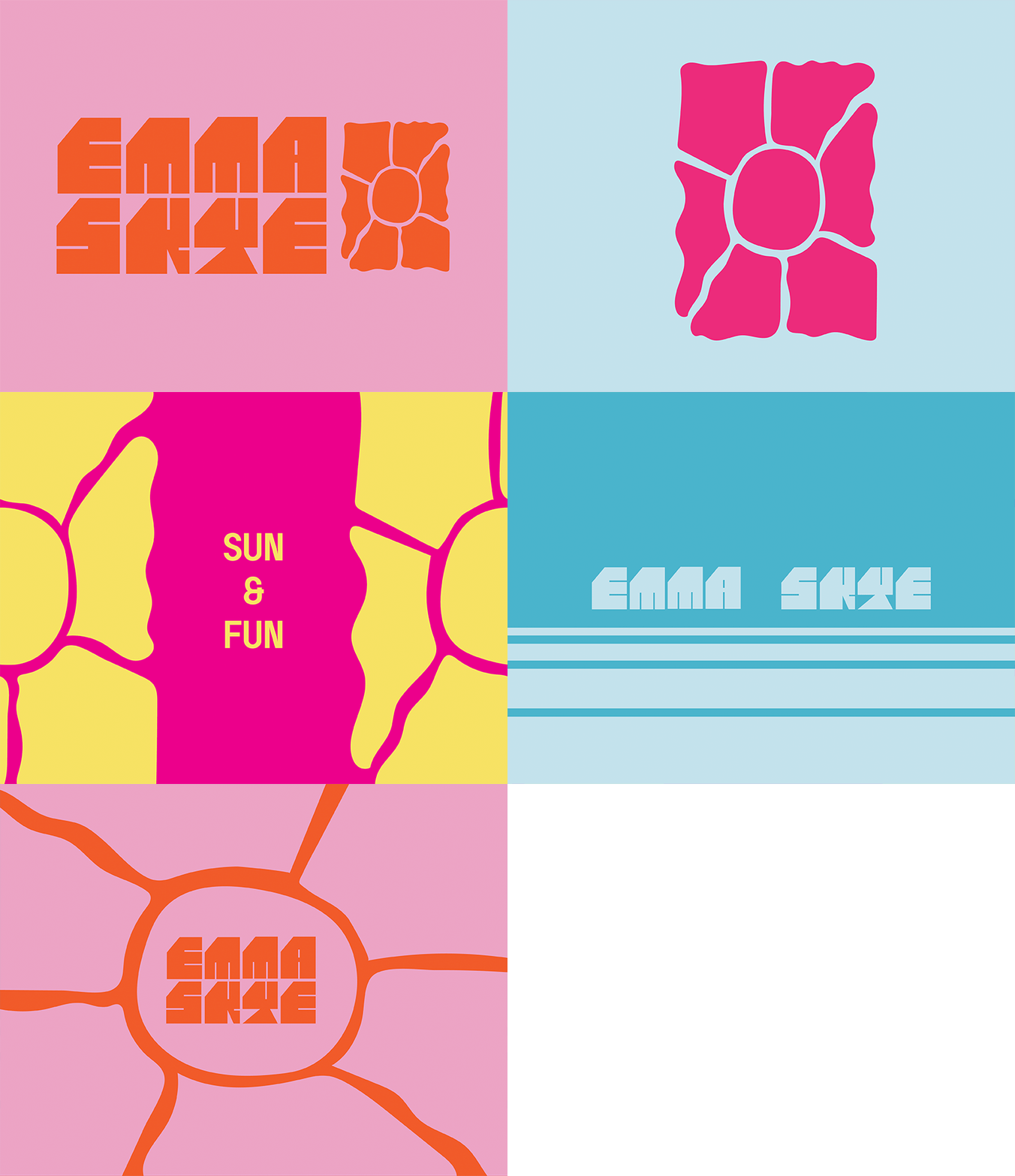
The most significant departure from the previous design was the introduction of a bold, colorful palette. We moved away from the stark black-and-white aesthetic to a range of vibrant, eye-catching colors. This multi-color approach reflects the diverse, dynamic nature of the products and appeals to the younger crowd who values individuality and expression. The colors were chosen not only for their vibrancy but also for their ability to create an emotional connection with the target audience. Bright tones like soft pastels and rich jewel hues were strategically combined to evoke feelings of energy, freshness, and warmth.
Typography
To reinforce the playful and youthful character of the brand, we opted for a custom, hand-drawn font paired with a more traditional typeface for balance. The hand-drawn font brings a sense of fun and authenticity, while the clean, contemporary typeface lends a level of sophistication and readability. Together, these elements give Emma Skye’s branding a perfect blend of modernity and approachability, appealing to the trendy yet discerning young consumer.
Logo & Iconography
For the logo, we focused on creating a modern, versatile mark that could easily be scaled across different product categories and marketing materials. The logo retains a level of minimalism to ensure flexibility but has been enhanced with the new color palette to bring out the vibrancy. Iconography was designed to match the brand's playful tone, with simple and straightforward visuals that complement Packaging Design
The packaging design was overhauled to align with the new, more energetic branding. We incorporated bold colors and abstract patterns to make each product stand out on the shelves, and to capture attention in the increasingly competitive beauty market. Each product variation features unique color combinations and graphics, creating a cohesive but diverse product line. This approach allows Emma Skye to present itself as a fun and fashionable brand, while still maintaining a high-end aesthetic.
Implementation & Results
The rebrand was rolled out across all of Emma Skye’s packaging, digital assets, and marketing materials. The new look was applied to the brand’s website, social media profiles, and product labels.
Early results have been promising, with positive feedback from both existing and new customers. The vibrant, colorful design has attracted a more youthful and diverse customer base, while the improved typography and clean lines have enhanced the brand's perceived quality. Sales have seen a noticeable increase, especially in local markets, where the new design has helped the products stand out and spark conversation.
Additionally, the brand’s social media presence has gained traction, with a significant uptick in engagement and followers. The vibrant, energetic aesthetic has resonated particularly well with the younger demographic, resulting in more buzz around the products and increased brand awareness.
Conclusion
The rebranding of Emma Skye has been a resounding success. By shifting from a minimalist, monochromatic identity to a bold and colorful design, the brand has successfully positioned itself as an energetic, youthful, and high-quality personal care line. The new visual identity not only captures the essence of Emma Skye’s products but also speaks directly to the target audience, establishing a strong foundation for future growth in the highly competitive personal care market.
The rebrand has breathed new life into Emma Skye, setting the stage for future product launches and market expansion. With its vibrant new look, the brand is primed for greater visibility, increased sales, and long-term success in both local and national markets.
My Role
Creative Direction


