


Case Study: Queen Esther Publishing - Debbie Burke "The Jazz Author" Book Series
Client: Queen Esther Publishing
Author: Debbie Burke, "The Jazz Author"
Overview
Queen Esther Publishing collaborated with world-renowned author Debbie Burke, known for her distinctive approach to storytelling within the jazz music genre. The objective was to establish a consistent and cohesive visual identity across Debbie Burke’s book series, enhancing brand recognition and appeal both in physical bookstores worldwide and through online sales platforms.
Objective
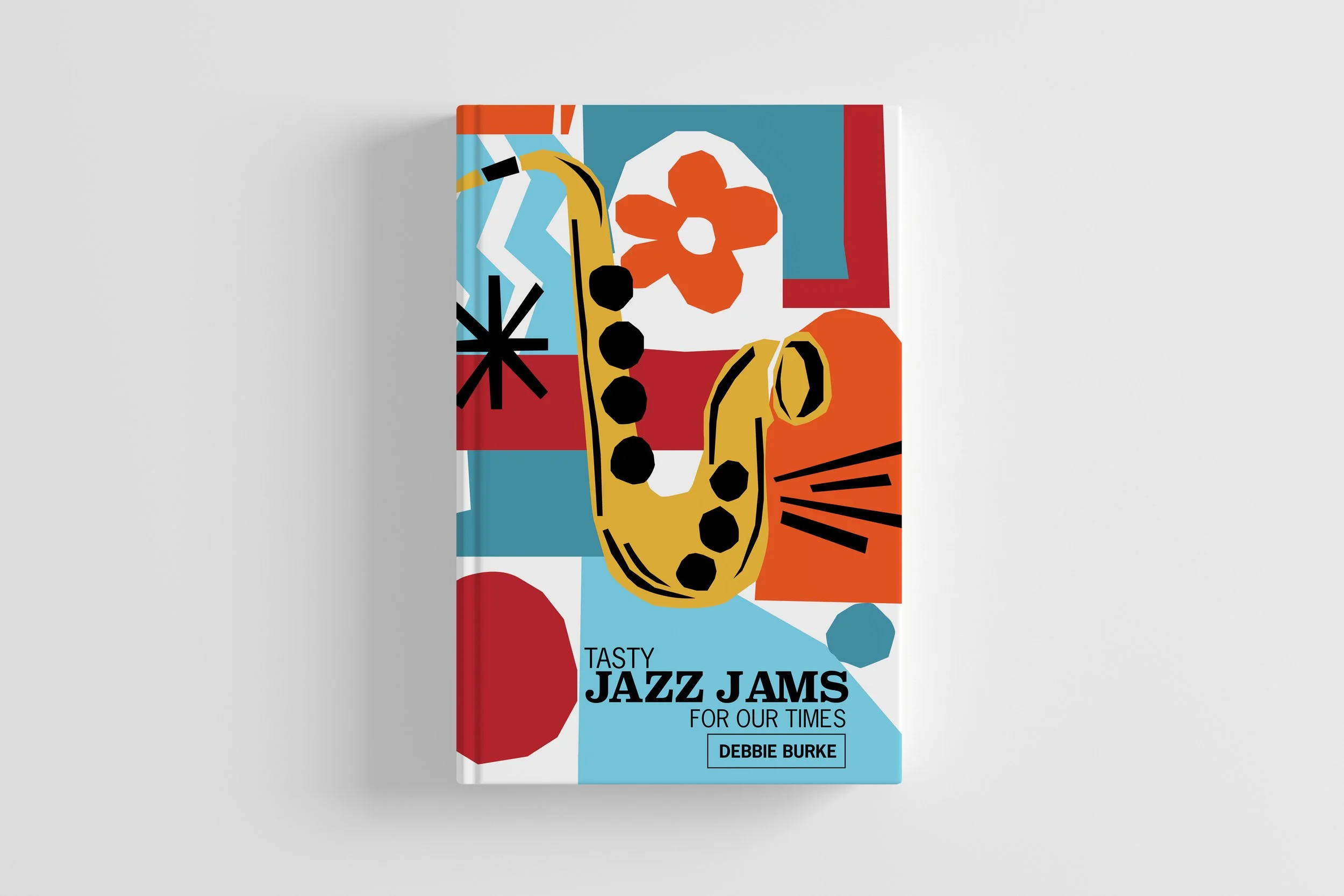
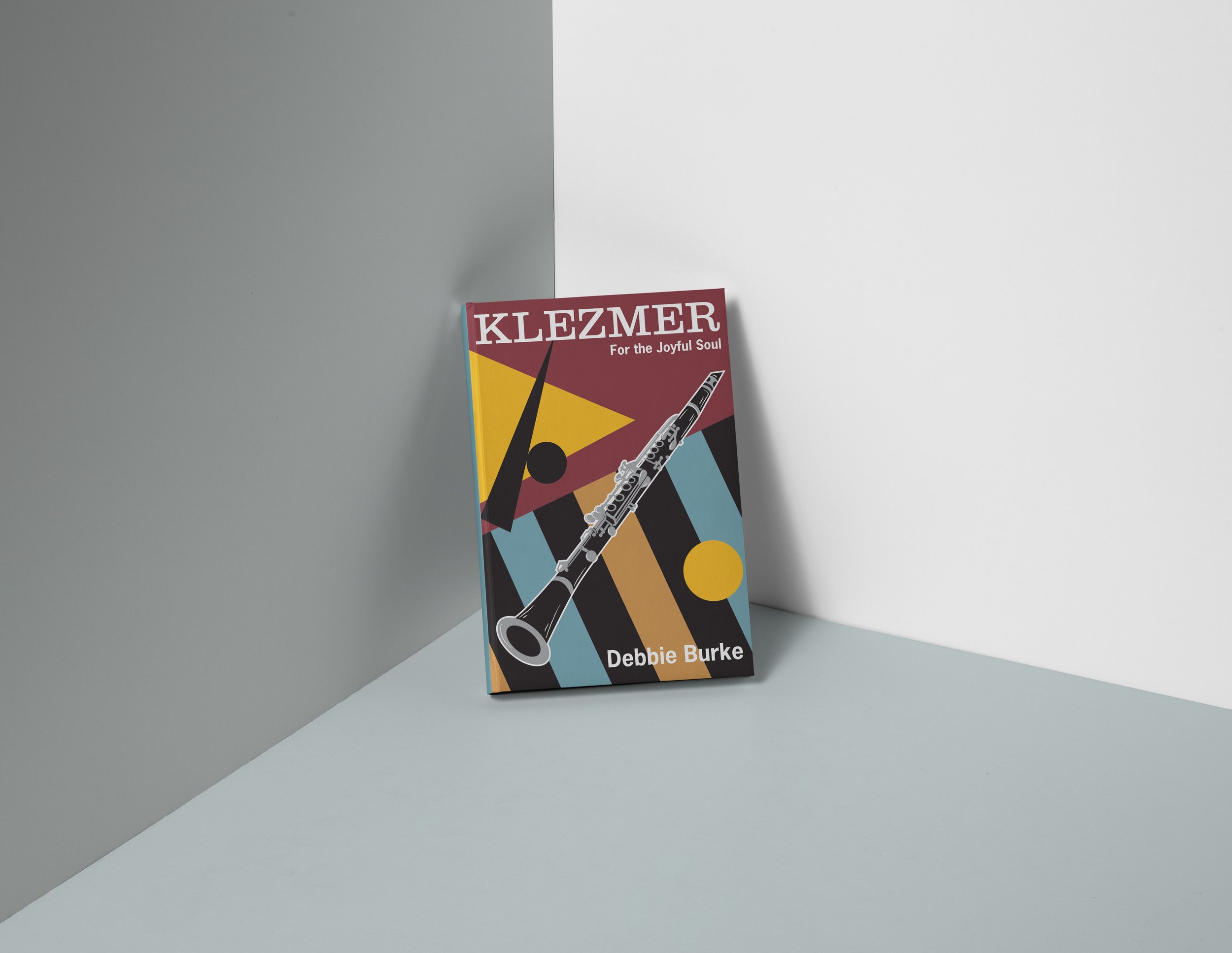
The primary goal was to create a unified look and feel for Debbie Burke’s book series, reflecting the essence of jazz music and vintage styling. Each book in the series explores various facets of the jazz genre, offering readers a rich and immersive experience. The challenge was to develop a design framework that could be seamlessly applied to future releases while maintaining visual continuity and market appeal.
Concept
The concept revolved around capturing the timeless allure of jazz through vintage-inspired design elements. The visual identity sought to evoke the elegance, nostalgia, and vibrancy associated with jazz music, ensuring each book cover and marketing collateral conveyed a cohesive narrative that resonated with both jazz enthusiasts and general readers alike.
Execution
Working closely with Debbie Burke and the publishing team, a meticulous design process unfolded to translate the concept into reality. Designers crafted a series of book covers and marketing materials that harmonized vintage aesthetics with contemporary appeal. The team ensured consistency in typography, color palette, and imagery, creating a recognizable brand identity that distinguished Debbie Burke’s books on shelves and online platforms.
Results
Debbie Burke’s book series under Queen Esther Publishing garnered significant acclaim and success, achieving strong sales in international bookstores and robust online engagement. The cohesive visual identity contributed to enhanced brand recognition and customer loyalty, with readers readily identifying and anticipating new releases based on the established design language. The series’ ongoing popularity underscored the effectiveness of the unified branding strategy in connecting with a global audience.
Conclusion
The collaboration between Queen Esther Publishing and Debbie Burke exemplified the power of cohesive branding in elevating literary works within a specific genre. By embracing vintage styling and thematic consistency, the project demonstrated how strategic design can reinforce storytelling and amplify market impact across diverse distribution channels.
Lessons Learned
This project highlighted the importance of aligning visual aesthetics with thematic content to create a compelling and recognizable brand identity. It underscored the value of maintaining consistency across series releases to foster reader engagement and build a loyal fan base. The ongoing success of Debbie Burke’s books reaffirmed Queen Esther Publishing’s commitment to quality and innovation in the competitive publishing industry.
This case study illustrates the strategic approach and successful implementation of a cohesive visual identity for Debbie Burke’s book series under Queen Esther Publishing, showcasing how design and branding can enhance literary storytelling and market presence in the global publishing landscape.
My Role
Creative Direction